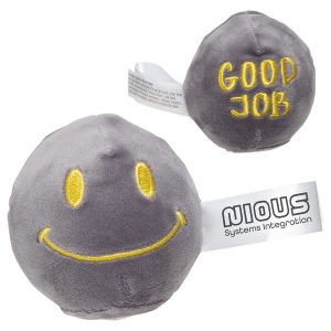
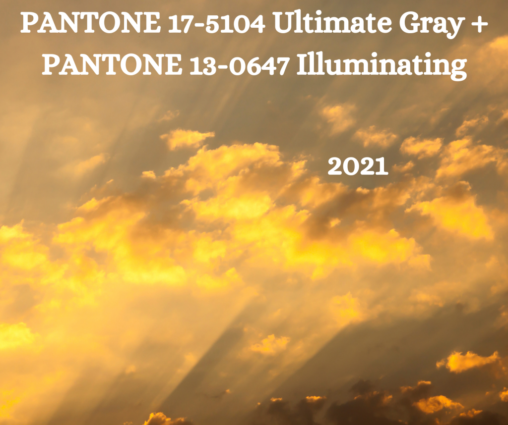
A sunbeam cracks through the gray clouds above. You turn your face toward it, basking in its unexpected warmth and beauty.
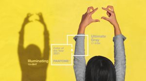
Congrats; you’ve just experienced Pantone’s Colors of the Year for 2021!
For just the second time, the Pantone Color of the Year is in fact a pair of colors: PANTONE® 17-5104 Ultimate Gray and PANTONE® 13-0647 Illuminating (this happened previously in 2016, when PANTONE® 13-1520 Rose Quartz and PANTONE® 15-3919 Serenity were featured). The Pantone Color Institute, which has selected a Color of the Year since 2000, regularly forecasts and consults on color trends, brand identities, and the leveraging of color psychology and emotion in design.
Pantone notes on their website that the two colors are exemplary of the way that “different elements come together to support one another,” a mood that they found valuable heading into 2021. They emphasize Ultimate Gray’s “deeper feelings of thoughtfulness” and Illuminating’s “promise of something sunny and friendly.”
In color theory, yellow is considered the color of happiness and optimism. It is recognized as the most attention-getting of any color. In Hinduism and ancient Egyptian religion, it was the color most associated with deity. Interestingly, yellow’s negative associations fall into illness and caution, two ideas that certainly lurk in the background of the coming year as well. But overwhelmingly, worldwide, it is a color of creativity and warmth.
Gray is a color associated with wisdom and compromise. It’s a color of stability, but with an eye toward the future, with echoes of industrial design and smooth, sleek efficiency. It can also be considered a color of boredom and ambiguity or uncertainty, which are also ahead for us — but at its best, it is a color of reaching a middle ground, something that would be a welcome respite from the many different types of extremes we’ve experienced in 2020.
“The union of an enduring Ultimate Gray with the vibrant yellow Illuminating expresses a message of positivity supported by fortitude,” said Pantone Color Institute Executive Director Leatrice Eiseman in the announcement of the colors. “Practical and rock solid but at the same time warming and optimistic, this is a color combination that gives us resilience and hope. We need to feel encouraged and uplifted; this is essential to the human spirit.”
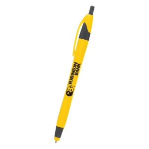
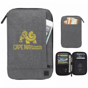
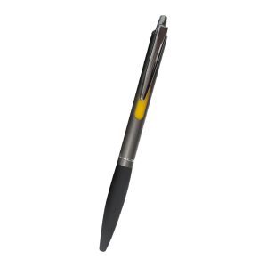
In marketing and promotions, teaming these two colors together will give your customers a sensation of a steady foundation from which to launch into a joyful positivity. They work together to make consumers feel safe and secure enough to be hopeful again—something that will be invaluable as we work to lift the economy as well as our spirits. Consumer confidence is going to be crucial to everyone’s experience of the coming year, and pairing Ultimate Gray and Illuminating in marketing opportunities can help to foster that.
“Emboldening the spirit,” the announcement reads, “the pairing of PANTONE 17-5104 Ultimate Gray + PANTONE 13-0647 [Illuminating] highlights our innate need to be seen, to be visible, to be recognized, to have our voices heard.”
This is the perfect opportunity for you to listen to your customers’ needs and highlight both your reliable infrastructure and your willingness to cast your eyes forward to a better future.
