By: PPB Newslink
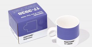
Citing the transformative nature of modern times and more anticipated transition ahead, color matching and design authority Pantone has named its Color of the Year for 2022: PANTONE 17-3938 Very Peri, an “inquisitive and intriguing” mix of blue and red hues.
The particular shade of purple is a new creation by Pantone, marking the first time a new color has been named Color of the Year.
The New Jersey-based company, whose proprietary color palette is widely viewed as the standard in design across a vast array of industries—including the printing and manufacturing germane to the promotional products marketplace—has named colors informed by the times each year since 2000. The decision comes through trend analysis of multiple genres, including entertainment, fashion, art, lifestyle, technology and more.
“As we move into a world of unprecedented change, the selection of PANTONE 17-3938 Very Peri brings a novel perspective and vision of the trusted and beloved blue color family,” says Leatrice Eiseman, executive director of Pantone Color Institute. “Encompassing the qualities of the blues, yet at the same time possessing a violet-red undertone, PANTONE 17-3938 Very Peri displays a spritely, joyous attitude and dynamic presence that encourages courageous creativity and imaginative expression.”
Pantone Color Institute is the business unit within Pantone that highlights the top seasonal runway colors, selects the Pantone Color of the Year, forecasts global color trends and advises companies on color for product and brand visual identity. Through seasonal trend forecasts, color psychology, and color consulting, Pantone Color Institute partners with global brands to effectively leverage the power, psychology, and emotion of color in their design strategy.
“The Pantone Color of the Year reflects what is taking place in our global culture, expressing what people are looking for that color can hope to answer,” says Laurie Pressman, vice president of the Pantone Color Institute. “Creating a new color for the first time in the history of our Pantone Color of the Year educational color program reflects the global innovation and transformation taking place. As society continues to recognize color as a critical form of communication, and a way to express and affect ideas and emotions and engage and connect, the complexity of this new red violet infused blue hue highlights the expansive possibilities that lay before us.”
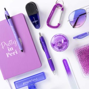
Make sure to include Very Peri in your next sales promotion. It is a simple and easy way to keep your company moving with current trends.
